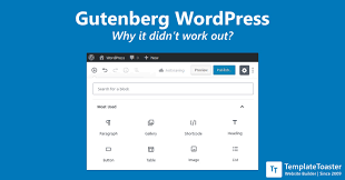
 This is a badly written rant I’ll say up front. Done in ten minutes. But I DON’T CARE – Gutenberg WordPress Block Editor has wasted so much of my time. The answer is I don’t know why WordPress Gutenberg is so bad. Actually – I probably do know why; it’s been designed by some very clever – no too clever people who know what they are doing when it comes to making WordPress do stuff. In that respect I’m certain it is brilliant. Secretly I REALLY appreciate what WordPress and even the Gutenberg folks are trying to do – I want to encourage them to fix it.
This all started as I wanted to add ONE single picture aligned left into a paragraph – and could I do it after an hour trying? No!!!
OK I’m stupid I admit it. Yet I’ve installed server software LAMP using command lines, installed WordPress multisites, sorted out basic software bugs and conflicts, done domain mapping, created 50+ websites that do all kinds of stuff – but I can’t use Gutenberg block editor – or at least not for more than ten minutes remember how any of it works. Stuff jumps about above and below where I want it. Now I have to install wretched WordPress Classic Editor Plugin AGAIN!!!! The trouble is – I just can’t use it – at all – not even the first thing works as I’d expect intuitively but there is absolutely NOTHING intuitive about Gutenberg WordPress editor – it’s absolutely the most terrible update to a piece of software I’ve ever encountered – where things are supposed to be streamlined and simplified and made easier hands down (I’m not being horrible – I and desperate for the geniuses who made it – because I know they are really geniuses just not thinking straight – will re-think and restructure what I can see might be great).
I keep trying to learn it watching videos and get hopeful – then in a day or two forget where everything is because it’s all over the place
PLEASE NOTE: I have successfully learned and remember Elementor page layout and website editor – not that easy for a non-techie like me, but it’s OK and fairly simple once you try. But Gutenberg?!!.. were they smoking something when they did this update? I can’t think of any other reason it would be such a mess – and yes it is pretty – but that does NOT matter. Perhaps the front-end folks are to blame and the back-end people had nothing to do with it – obsessing way too much over minimalism as seems to be the trend have forgotten to put things TOGETHER – in placed you’d expect them. Sometimes interfaces designed by techies are better as they are logical people, but often worse as they are not thinking like plebs like me and you need a designer. But in this case I think tell the designer to stop trying to be cool – or get him off the funny stuff!
The old WordPress editor was easy – and worked perfectly and intuitively – EVERY TIME!
I pretty much figured out all of the old editor WITHOUT watching a single video. You added a picture and it went in beautiful – re-align – perfect. Add a bit of text – style a headline to H1 – easy as pie. Gutenberg… or Gutenblerb as I want to call it – I just stare at the page with no idea how to add anything – and when I do click the [ + ] to add a photo or paragraph and try something – things jump about all over the place, insert themselves where the cursor isn’t -and I still cannot figure out how to view the page when I’ve saved the edits that I just couldn’t make.
I don’t want that daft preview link where it spends several seconds constructing something – I don’t actually know what – then to add confusion – there appears (for a few moments before its done) a view page at the bottom. Then there are some other links Page > Something at the bottom too that make no sense.
I still live in hope that Gutenberg will be fixed..
Every few months I turn off the WordPress Classic Editor Plugin in the vain hope that someone at WordPress – a GREAT AND UTTERLY FANTASTIC piece of software has removed the person or persons who are determined to to be too clever and at least get them together with some numpty’s like me and WATCH them actually attempt to use it. They will see straight away the problems. I am so p’d off that I’ve taken time out I really do not have – and written this lame article between time as I’m SOOO annoyed I have wasted literally hours staring at Gutenberg and never can figure out how to edit a page or post or what is it? I’m hoping someone at WORDPRESS sees this cry for help before I do something awful to myself trying to use it.
A few of glimmers of hope
There are however some parts I DO like – I think – though it’s still not as easy as the old WordPress page editor tat the options on the right hand side are fairly easy to use – but the problem is, in an attempt to make it simple – it is now fragmented all over the place. I’m actually scared to click anywhere as crap and boxes pop up all over the place – all different ones. There needs to be ONE box – from where you easily find all the options. I just added a picture to my page but as I’m writing this I still can only think there are dozens of boxes – which one was it? And last and most annoying – where the heck does my WordPress Admin bar on left hand side disappear too?!


